The Big Chill Festival
This project presents a complete redesign of The Big Chill Festival website and touch-screen kiosk experience, aimed at enhancing user engagement, accessibility, and brand identity. Inspired by the festival’s fun, relaxed atmosphere, the new design integrates playful visuals, cohesive color schemes, and intuitive navigation.
From initial research and analysis to the creation of moodboards, style guides, wireframes, and final execution, every step was carefully crafted to reflect the spirit of the festival. The redesigned website and kiosk not only streamline ticket purchasing and wristband retrieval but also evoke an immersive, joyful experience that celebrates creativity, community, and the essence of The Big Chill.
Part 1 – Research and Planning
This phase focused on analysing existing brand and web presence, evaluating SEO performance, and studying site structure. It included website and kiosk design precedents, a proposed new site map, wireframes, user flow strategies, and homepage design comparisons to inform a user-centered and intuitive digital experience.
In order to redesign, it is important to understand the current website by analysing its objectives, branding, design elements, layout, interactive features, SEO performance, and existing site map. This comprehensive review of the brand and website analysis identifies strengths, weaknesses, and areas for improvement, forming a clear foundation for creating a more effective user experience.


By examining existing websites and touchscreen kiosk precedents, effective design elements, layouts, and interface strategies are identified. Analysing these references helps extract relevant features that inform and inspire the redesign, ensuring the final outcome aligns with contemporary usability standards and enhances the overall user experience.


This section showcases the differences and changes made between the current website's sitemap and the proposed new sitemap. It highlights improvements in structure, navigation, and content organization to enhance user experience, making the site more intuitive, efficient, and aligned with the goals of the Big Chill Festival’s digital presence.


Wireframe is essential to outline the structural framework and user flow of the redesigned website. This section provides a clear, instructional layout of each page, detailing content placement, navigation, and interactive elements to guide developers and ensure the design vision is accurately translated into a functional digital experience.

HOME

EXPERIENCE

WHAT'S ON

TICKETING

SCHEDULE

FAQ & CONTACT US
Navigating toward the final goal of ticket purchasing, users are guided through a clear and intuitive journey. A consistent button placed across all pages directs them straight to the Humanitix website, ensuring accessibility and a smooth transition that supports the overall user experience and website functionality. This user flow chart visualises this process.

Part 2 – Website and Brand Style Guide
In this stage, a cohesive visual identity was developed through a detailed moodboard and creative style guide. Typography, colour palette, iconography, and layout systems were defined to ensure brand consistency across all digital touchpoints, forming the foundation for the visual direction of the final design.
The moodboard captures the overall feeling and atmosphere the redesigned website aims to evoke. It guides the visual direction by reflecting key emotions and experiences, helping shape design decisions that resonate with users. This foundation ensures a cohesive, engaging, and intentional user experience throughout the final website design

The creative style guide establishes the foundational visual language for the redesigned Big Chill Festival website. It details rules for logo usage, color palette, typography, visual hierarchy, button styles, and image treatments. These consistent design choices ensure clarity, cohesion, and an engaging user experience while maintaining the brand’s playful and energetic identity.


Part 3 – Design Solution
This final stage delivers the visual communication outcomes of the project. It showcases a fully realised web design and an interactive kiosk interface. The solutions are guided by research and style systems, offering a polished, user-friendly experience that effectively communicates the brand’s identity and digital strategy.
Visual Communication of Design
Website
The design of The Big Chill Festival website is a carefully curated visual communication tool that reflects the festival's laid-back, fun, and engaging atmosphere. The overall design is characterized by a soft, pastel color palette, playful doodle elements, and rounded shapes, which together create a warm, inviting environment that aligns with the festival's casual and friendly vibe.
Visual Communication:
The website utilizes color, typography, and imagery to convey the festival’s identity. The pastel colors evoke a sense of relaxation, while the rounded shapes and bubbly fonts contribute to a playful, approachable feel. The doodles scattered throughout the design add a sense of spontaneity and creativity, reinforcing the festival's informal and fun nature. Each page
is designed with a clear visual hierarchy, ensuring that essential information, such as dates, ticket options, and artist line-ups, is easily accessible and highlighted.
Design Intent:
The intent behind the website’s design is to provide users with an intuitive, enjoyable experience while effectively communicating the festival’s key information. The navigation is straightforward, with the menu positioned at the top for easy access and shifting to the left on scroll for consistency. This layout ensures that users can explore different sections without getting lost.
The homepage focuses on essential elements like the countdown timer, artist previews, and CTA buttons for ticket purchases. The decision to move media-heavy content such as the Spotify playlist, promotional video, and photo gallery to other pages helps to streamline the homepage, reducing overwhelm and keeping users engaged.
Each page serves a distinct purpose—whether it's providing logistical information, showcasing the artist lineup, or facilitating ticket purchases—yet they all maintain a cohesive visual style that ties back to the festival's branding. The inclusion of additional festivals on the homepage not only cross-promotes related events but also enhances user engagement by offering more options.
In summary, The Big Chill Festival website design effectively combines visual appeal with functionality, creating a user-friendly platform that mirrors the festival's ethos of fun, relaxation, and community. The cohesive use of color, form, and playful elements ensures a consistent experience across all pages, making the website an integral part of the festival's overall branding and communication strategy.
Kiosk
The design of The Big Chill Festival wristband retrieval page maintains the cohesive visual language established throughout the festival’s website while introducing interactive elements crucial for the event experience. The visual communication emphasizes clarity, user engagement, and consistency with the festival's branding.
Visual Communication:
The pastel color palette, playful doodle elements, and rounded shapes continue to dominate the design, creating a friendly and approachable atmosphere. The use of bold, bubbly fonts for headings ensures that users can easily identify the key actions
they need to take, such as retrieving their QR codes or scanning to get their wristbands. The recurring elements like pastel backgrounds, tape-like highlights, and doodles reinforce the festival’s relaxed and informal vibe. Imagery, such as the retro phone and envelope icons, adds a nostalgic touch, making the interface feel more personal and engaging.
Design Intent:
The intent behind this design is to facilitate a smooth and enjoyable process for attendees to access their wristbands, essential for entry and participation in the festival. The design focuses on simplicity and user-friendliness, ensuring that even those who are not tech-savvy can navigate the process with ease. The prominent “Get Your Wristbands Here” call-to-action is the focal point, guiding users directly to the steps they need to follow.
Interactive elements are designed with user guidance in mind. For example, options to retrieve QR codes via email or phone number are presented with clear, easy-to-use input fields and buttons. The use of a map at the bottom of the pages aids in orienting users to their location, adding a practical dimension to the design. The error page, with a playful icon and supportive message, ensures that any issues encountered are handled with a positive, reassuring tone.
The overall intent is to streamline the wristband retrieval process while maintaining the festival’s branding. The cohesive design ensures that users feel a seamless transition from the website to the event, enhancing their overall experience and reinforcing the festival’s identity as a fun, relaxed, and well-organized event.
The final website design presents an overview of all six pages, followed by detailed breakdowns of each. It highlights the color schemes, photo treatments, shapes, and layout hierarchy used. Each page reflects consistent branding and visual storytelling, using narrative codes and design elements that guide user interaction and enhance usability.


HOME PAGE

EXPERIENCE PAGE

WHAT’S ON PAGE

TICKETING PAGE

SCHEDULE PAGE

FAQ & CONTACT US PAGE
The final kiosk design showcases all eight screen displays, outlining the step-by-step user flow for wristband retrieval. From the welcome screen, users select their method (email or phone), input details, and receive a QR code. Each screen emphasizes intuitive navigation through thoughtful color treatment, hierarchy, layout, and playful visual language consistent with the festival’s identity.


IDLE SCREEN

ACTIVE SCREEN: SCAN QR CODE TO GET WRISTBANDS

ACTIVE SCREEN: SCAN TO RETRIEVE TICKETS USING EMAIL

ACTIVE SCREEN: SCAN TO RETRIEVE TICKETS USING PHONE NUMBER

ACTIVE SCREEN: RETRIEVE CODE USING EMAIL
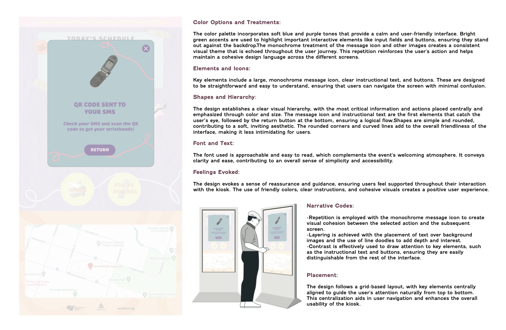
ACTIVE SCREEN: RETRIEVE CODE USING SMS

ACTIVE SCREEN: ERROR

ACTIVE SCREEN: FINAL PAGE