Croissant Au Beurre
typeface & book cover design
This typeface design is inspired by the process of making croissants, focusing on the intricate folding, rolling, and layering that gives croissants their signature flaky texture. The goal was to transform these tactile qualities into a visual form, creating a font that is both playful and sophisticated, balancing the appeal with readability. The design emphasizes soft curves, layered strokes, and rhythmic movement, reflecting the sensory experience of enjoying a croissant.
This three-part coffee table book series explores the diverse pastry traditions of France, Japan, and Indonesia, combining the practicality of recipe books with the aesthetic appeal of coffee table books. Drawing on market research, the design challenges the typical culinary book format, which often relies heavily on enticing food photography, by incorporating refined graphic illustrations paired with a custom typeface inspired by the folding and layering of croissant dough. This decorative typeface enhances the series’ aesthetic while reinforcing its narrative connection to the art of pastry-making, aligning with Willen & Strals (2009) and their emphasis on balancing artistic expression with legibility. The design aims to merge functionality with artistry, ensuring the books are both practical and visually captivating.
Part 1: Typeface Design
CONCEPT STATEMENT
This typeface design is inspired by the process of making croissants, focusing on the intricate folding, rolling, and layering that gives croissants their signature flaky texture. The goal was to transform these tactile qualities into a visual form, creating a font that is both playful and sophisticated, balancing the appeal with readability. The design emphasizes soft curves, layered strokes, and rhythmic movement, reflecting the sensory experience of enjoying a croissant.
The first design decision was to incorporate layered and overlapping strokes within the letters, mimicking the folding process of croissant dough. According to Bringhurst (2004), effective typography relies on proportion and spacing to achieve visual harmony. Inspired by this, the typeface uses layered elements to create a sense of depth and rhythm while maintaining readability. The layering effect captures the visual texture of a croissant dough, suggesting a sense of movement and flow. This approach ensures the font has a textured and dynamic quality without compromising the main function, making it suitable for various visual applications.
The second key design element was the use of dynamic curves and variations in stroke weight, reflecting the natural flow of dough as it is rolled and shaped. Carter et al. (2018) emphasized the role of typography in establishing visual elements through variations in size, weight, and spacing. This influenced the decision to use thicker, bold curves that cater into softer, thinner lines, creating a sense of motion and guiding the reader’s eye smoothly across the text. This variation not only improves the typeface's visual appeal but also making clear communication by displaying the text as engaging and easy to read. By varying stroke thickness, the letters feel more alive and fluid, emphasizing the process of dough stretching and folding.
Throughout the design process, prototyping and many refinement were crucial, influenced by Lupton (2011). This approach encouraged experimentation with forms, layering effects, and curves, allowing for a balance between aesthetic and functionality. By testing and refining the typeface, the design captured both the visual and tactile qualities of croissant dough, ensuring that the final product was innovative and adaptable. This flexibility in development allowed the typeface to maintain a expressive character while ensuring functionality across different media.
In conclusion, this typeface transforms the physical attributes of croissant-making—its layers, folds, and curves—into a dynamic and engaging visual form. By applying principles of spacing, hierarchy, and creative experimentation from Bringhurst (2004), Carter et al. (2018), and Lupton (2011), the typeface effectively balances readability with visual appeal. The final design will present viewers to see typography as a sensory experience, mirroring the layered, delicate texture of croissant dough. It offers a different visual language that is both unique and expressive.
Alphabet Glyphs

Part 2: Coffee Table Book Series
CONCEPT STATEMENT
The tailored color palettes and graphic illustrations capture the unique essence of each region’s pastry traditions. France, representing precision and elegance, features buttery yellows, warm golds, burnt orange, and creamy white to evoke the richness of iconic pastries like croissants, mille-feuille, and macarons. These colors underscore the refinement and sophistication of French baking. Japan, characterized by innovation and subtlety, uses soft pink, deep matcha green, light green, and creamy white to reflect the minimalist and airy textures of mochi, dorayaki, and melon pan. These tones highlight Japan’s harmonious blending of tradition and modernity. Indonesia, known for its cultural fusion and bold flavors, employs bold red, warm yellow, soft lavender, and light cream to celebrate vibrant pastries such as klepon, lapis legit, and nastar. These tropical hues emphasize Indonesia’s rich flavors and colorful heritage.
To ensure visual cohesion and structural consistency, the design employs a three-column and four-column grid system. The three-column grid is utilized for the book covers, providing balanced arrangements of typography, illustrations, and negative space, while the four-column grid supports the internal layouts, creating organized and user-friendly content. This approach, inspired by Hurlburt’s (1981) insights on grid systems, allows for both creativity and clarity, ensuring that each book is polished, professional, and accessible. The integration of decorative typography within this framework ensures the typeface complements the illustrations and enhances the overall aesthetic.
Negative space plays a pivotal role in creating a modern, refined aesthetic. This design choice reflects Lupton & Phillips (2015), who highlight the importance of composition and spacing in visual storytelling. By prioritizing negative space, the design elevates the books beyond their functional purpose, transforming them into decorative objects suitable for display on coffee tables. The minimalist layouts emphasize the interplay between typography and illustrations, ensuring a sophisticated look while maintaining readability and ease of use for first-time bakers.
The iterative design process, guided by Lupton (2011), involved prototyping and refining layouts, color palettes, and typography to ensure a cohesive final product. The series also employs typographic hierarchy, as described by Lupton (2010), to guide readers seamlessly through headings, subheadings, and step-by-step instructions. Rooted in Tschichold’s (1991) principle of balancing form and function, the books serve both as practical guides and elegant decorative pieces. By blending tailored color palettes, decorative typography, refined illustrations, and structured grid-based layouts, this series celebrates the pastry traditions of three distinct cultures. It transforms culinary books into artistic and functional objects, appealing to bakers and design enthusiasts alike. This innovative approach merges utility and beauty, offering an inspiring and engaging perspective on pastry traditions.
Book Covers
French Patisserie

This cover embodies French refinement through buttery yellows, soft golds, and creamy whites, evoking warmth and elegance. Illustrated croissants and macarons add artisanal charm. Delicate serif typography and balanced spacing reflect precision and sophistication, creating a timeless design that honors the rich heritage of French patisserie culture.
Japanese Patisserie

Minimalist and serene, the design uses soft pink, matcha green, and cream to create a calming aesthetic. Mochi and dorayaki motifs float against clean, spacious backgrounds. The composition emphasizes balance, stillness, and subtle beauty, reflecting the Japanese philosophy of refined simplicity and mindful design in confectionery traditions.
Indonesian Patisserie

This bold cover bursts with cultural vibrancy using rich reds and coconut whites. Inspired by traditional treats like lapis legit and klepon, layered textures and rhythmic patterns celebrate Indonesia’s fusion of flavors. Dynamic typography and batik-like motifs create a festive, sensory-rich tribute to local dessert heritage.
Content & Internal Pages

Content Page of the French Patisserie Book

A glimpse into the page dedicated to Madeleines — showcasing the iconic shell-shaped sponge cake, its delightful variations, elegant serving suggestions, and expert tips for achieving the perfect rise and texture.

Step-by-step guide to mastering the perfect Madeleines — from gathering classic French ingredients to following each stage with visual references. This page breaks down the process with clear instructions, imagery, and helpful notes to ensure golden edges, a fluffy centre, and that signature hump every time.
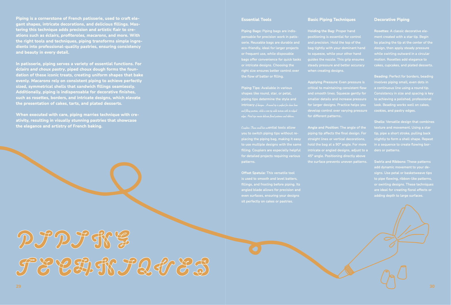
Explore the art of piping with this detailed guide — showcasing essential tools, recommended techniques for precision and control, and a variety of decorative styles from rosettes to shells. Whether you're a beginner or a seasoned baker, this page helps elevate your creations with refined, professional finishes.
Banner
This animated banner showcases the coffee table book series, aimed to promote this book for marketing purposes. Highlighting each region’s unique aesthetic and flavor palette. Featuring the work of Dominique Ansel, it invites viewers to explore all three books and discover the artistry behind global pastry traditions.
REFERENCES
Apfelbaum, S., & Cezzar, J. (2014). Designing the editorial experience : a primer for print, web, and mobile. Beverly, Massachusetts: Rockport Publishers.
This book emphasizes cohesive storytelling across different media. It supports unifying the book covers, internal layouts, and web advertisements through consistent design principles. This ensures a visually compelling and coherent narrative that strengthens the series’ overall appeal.
Hurlburt, A. (1999). The grid : a modular system for the design and production of newspapers, magazines, and books. New York ; Chichester: Wiley.
Hurlburt explores grid systems to ensure structural consistency in layouts. The use of three-column and four-column grids organizes typography, illustrations, and negative space, creating a polished and professional look that supports clarity for first-time bakers while maintaining a modern coffee table book aesthetic.
Lupton, E. (2010). Thinking with type : a critical guide for designers, writers, editors, & students. New York: Princeton Architectural Press.
Lupton offers strategies for maintaining typographic hierarchy, ensuring a balance between aesthetic and functional elements. These principles guide the arrangement of headings, subheadings, and body text, enabling clarity and cohesion across the covers and internal layouts, enhancing both usability and visual sophistication.
Lupton, E. (2011). Graphic design thinking : beyond brainstorming. New York, New York, Baltimore [Maryland]: Princeton Architectural Press ; Maryland Institute College of Art.
Lupton highlights the importance of rapid prototyping and iterative experimentation, which guide the design process in testing layouts, palettes, and typography. This approach ensures a harmonious balance between aesthetics and usability, allowing negative space, illustrations, and type to interact cohesively in creating a visually unified series.
Lupton, E., & Phillips, J. C. (2015). Graphic design : the new basics. New York: Princeton Architectural Press. This source emphasizes modern design principles like color theory, composition, and visual storytelling, helping enhance the series' bold, cohesive aesthetic. It guides the use of contrasting palettes, refined illustrations, and negative space, aligning with the aim to create a contemporary, sophisticated look.
Tschichold, J. (1991). The Form of the Book. Point Roberts, Wash. ; Vancouver, B.C. : Hartley & Marks.
Tschichold’s principle of balancing form and function informs the design's merging of usability and artistry. By applying his insights, the series ensures visual appeal for display as coffee table books while maintaining clear, intuitive layouts suitable for bakers, achieving practical and decorative excellence.
Willan, A., Cherniavsky, M., & Kyri Claflin. (2012). The cookbook library : four centuries of the cooks, writers, and recipes that made the modern cookbook. Berkeley: University Of California Press.
This source provides historical context on cookbook design, emphasizing the cultural significance of traditional elements like enticing imagery and regional recipes. It informs the blending of these traditions with modern trends, resulting in books that feel timeless yet innovative, honoring pastry traditions.
Willen, B., & Strals, N. (2009). Lettering & type : creating letters and designing typefaces. New York: Princeton Architectural Press.
This source emphasizes the creative potential of custom typefaces, focusing on the balance between artistic expression and legibility. It supports the use of a typeface inspired by croissant folds as both a decorative and functional element. The typeface ties into the pastry theme while ensuring readability, making it integral to the book covers and layouts.